
Which colors to use...
Ok, the wall border is going halfway down on the wall, like a chair rail, and we're using pink on top and purple/violet on the bottom. What I can't decide for sure is whether to go with the lighter or deeper version of the colors.
Here's the lighter version...the colors are Sweety Pie and Purplicious.

And the deeper version is Nana's Rose and Violet Twist. The rose is exactly the same color as the pink stripe in the top of the border and the violet is pretty much exactly the color of the crayon-like outline of the daisies.
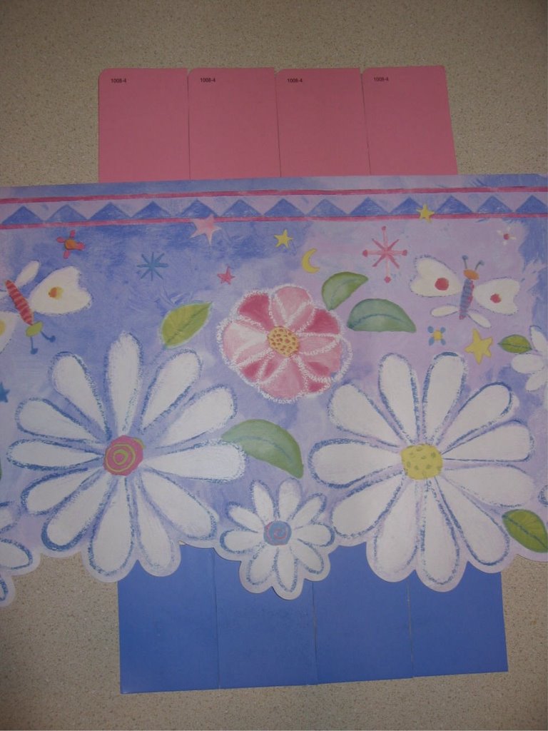
Typically, I go with the richer, deeper colors, but I'm questioning myself on this since it's a nursery and I wonder if it should be lighter. The furniture will be white and you can see some of the other items I have in my previous posts.
I'd love to hear everyone's opinion on this...for some reason, I'm a little stuck.
posted by Donna @ 4:05 PM
21 comments
![]()
![]()

21 Comments:
Hi Donna. First of all, I LOVE the border! It's so cute and girly. I can't wait til you get Lauren's room done! With that being said the choice, for me, is an easy one. I would go with Sweety Pie and Purplicious. The names alone sealed the deal. LOL. Just kidding. The reason I like the first choice is because it's softer and will highlight the border. I think the second choice will overpower and take away from the border. And the border is just so beautiful! That is just my take. I do love how you plan on painting the two different colors! In the end, you know that either will look fabulous! :)
I am voting for the darker colors. I like deep colors and think they would look great with white furniture. I love the border you have picked.
I like the deeper colors (2nd picture). I can see where the darker shade of purple might seem too much, but I think the darker purple brings out the crayon outlines of the flowers and really makes them pop (I've been watching Trading Spaces,can ya tell?). And the Nana's Rose does the same for the color along the top of the border. I wonder if the lighter shade of pink would get lost.
There. Now you're one for one. Now what're ya gonna do? ;).
Beautiful border! I vote for the darker colors. I think the light pink a little too washed out...just my opinion though.
I vote for the deeper colors. I just love rich colors and think that they would be beautiful. Plus, she won't be a baby for very long, so the deeper colors will look great when she is a toddler, pre-schooler and even through elementary school.
My vote is for the deeper colors. I cannot wait to see the finished product!
Ok - I vote for the lighter colors. I think that darker blue will be overpowering and will lead the eye to the bottom half of the nursery walls. The lighter colors accent the border. Also, when you paint the walls it will be much darker than the paint swatches! How about making some sample boards with each combination and look at it with the different lighting in the room...just "live" with the boards for awhile and make your decision! Another suggestion if you go with the darker colors and it ends up being too much, apply a white glaze to soften it up.
Okay, too many cooks spoil the soup! I am opposite of Julie, I like the darker pink and the lighter blue, however I don't trust myself now that I've read what Julie wrote, because I consider her a color expert. Whatever you do it will look so cute! I do agree with others that things look much darker on the walls than you think they will.
No, I've changed my mind now, I like the lighter pink better. Decisions, decisions!
The top colors hands down.
I am a woman of color (I love color) so I go with the darker color.... She can grow into the room and it can be a toddler room and a girlie room....
Lisa
I usually like darker colors, but in this case I have to vote for the top option. I think the border shows up better against the lighter tones. On the bottom option, my eye is drawn to the brightness of the purple rather than to the super cute border! I agree with Shelli's suggestion of making up sample boards - the color will look a lot different as the light changes in the room throughout the day. See what looks good at 2:00 a.m - as that's when you'll be staring at it most :-)
Heather
I am with Julie. The lighter pink on top, the darker blue on bottom. I would use as much hot pink/dark rose accent pieces in the room to bring out the darker pink in the border. You will probably pick up lots of pink to add to the room - like bedding, pillows, toys..... Just my opinion!
Alyson
I like the top one better. I love a child's room to be bright and welcoming. They're both great choices but my preference is for the lighter version.
Have fun decorating! Looking forward to seeing pics of the completed project.
I like the lighter ones myself. The boarder is too cute! Where did you get that?
Donna,
Just my 2 cents...I fell in love with some paint chips, put them on the wall and they looked totally different. I think you will only know after you paint like a 2x2 area of each color and compare. I am thankful I did that as my color choices were totally different once I saw them on the wall both in day and evening light. You may be surprised with what you like once you do that.
Love the border! I love the richer colors. It will look beautiful with the white furniture!!!
Good luck and let us know what you choose!
Carrie
Gosh girl - I love your taste in selections! I'm leaning towards the softer colors so as not to overpower other items added to the room. My suggestion would be to buy some quart size samples and paint large squares on the walls so you can see the colors in the different lights! Can't wait to see pics of the progress!
Go with the darker of the shades it will look great with the white furniture and all the soft colors you add as accent colors
Boy did you open a can of worms or what? I vote for the lighter colors. All those colors are going to darken up on the wall. The darker colors are going to be A LOT darker once their on the walls. I think lighter colors for a little girl's nursery will look better.
Im curious what color scheme you decided on? I used the same border and choose a purple on the bottom and yellow on top. From your 2 picks I really like the lighter choices. :)
Post a Comment
<< Home